INVEST LIKE A TRADESMITH
World-Class Investment Tools
Discover hedge fund-level insights designed for the individual investor, like you.
60,000+
Investors on the platform
$30 Billion
Capital invested using our tool
94%
Customer satisfaction across the board
As seen on
Our Products
Designed to help take the emotion out of investing, our data-driven
software turns macro-trends into actionable insights.
predictive alpha
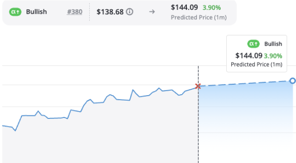
Access Wall Street-caliber A.I. stock predictions designed specifically for the everyday investor
Predictive Alpha uses TradeSmith’s own A.I.-powered stock prediction system to provide price forecasts on thousands of stocks. These forecasts could enable you to avoid losses and make big monthly gains with a level of certainty that’s rarely — if ever — been achieved before.
See AN-E in action
A.I.-informed stock price predictions at your fingertips.

Industry-leading proprietary A.I. algorithm
Timely & relevant updates and alerts
Curated portfolio of stocks predicted to soar
Automated Buy & Sell Alerts
Our system will take the guesswork out of trading by alerting you when to get in and when to get out of any given stock.
Multi-factor security brokerage sync
Position size calculator for your own portfolios
Asset allocation tool to balance your positions
tradestops
Know precisely when to buy and when to sell.
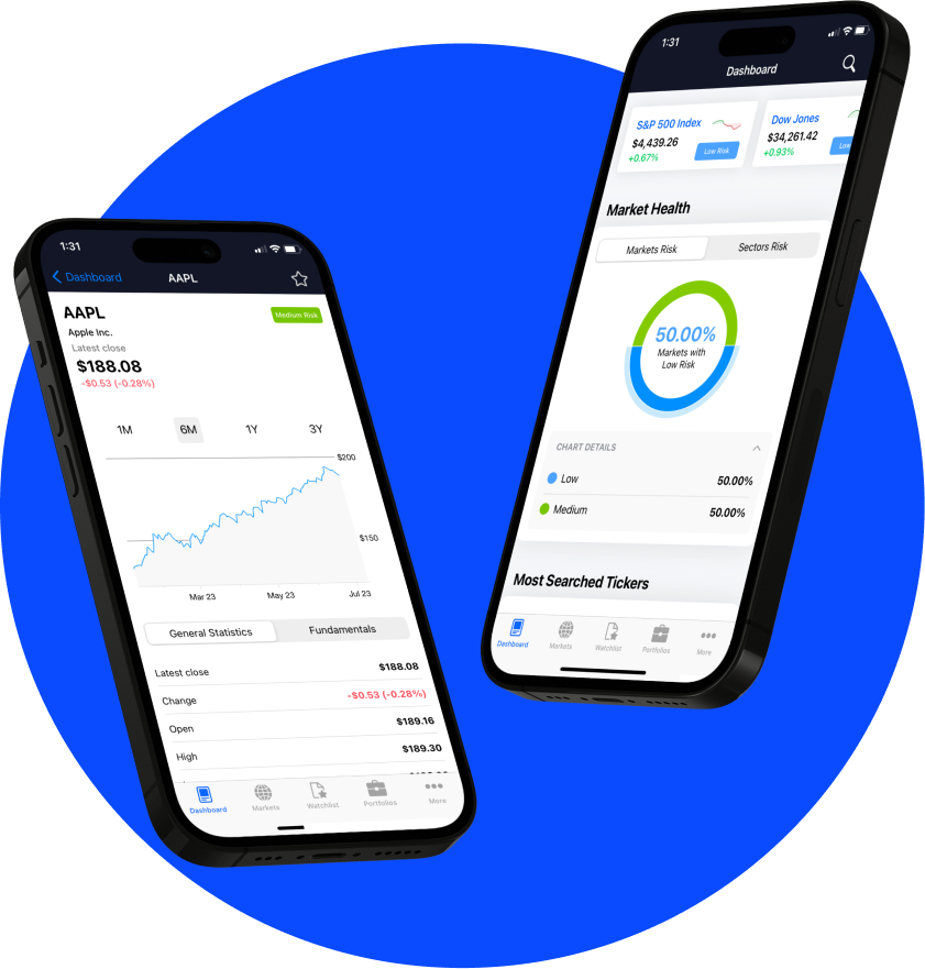
TradeSmith’s flagship product, TradeStops helps investors effectively and efficiently manage their investments. With powerful risk-based tools, TradeStops is designed to help you invest with risk parity.
Options360
Options-based opportunities without all the hassle.
Use pre-built screeners to find options opportunities based on probability of profit, return on investment, and more. Or build your own custom screener to match any strategy you follow.
95%
Win Rate
+385%
Average Gain
Price Forecast
Get peace of mind by seeing a stock’s volatility, before you ever buy.
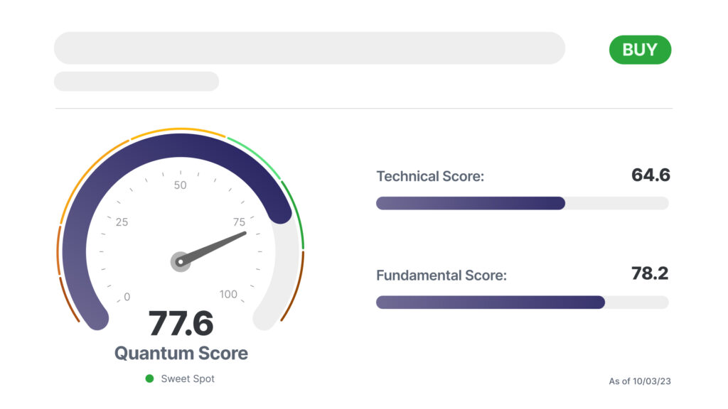
The Quantum Score Adds Up
Jason Bodner’s proprietary system blends a technical and fundamental score to create a total Quantum Score that gives you Jason’s conviction level based on Big Money movement.

Real-time analysis with market shifts
Actionable insights delivered daily
Plug-and-play portfolio tools
quantum edge Pro
Quantitative analysis from an expert you can trust.
Quantum Edge Pro uses quantitative analysis of the best stocks in the market to find the strongest performers – the best of the best – based on fundamental and technical analysis.
Latest Research
Stay up to date with the latests insights and market analysis from our top editors.


